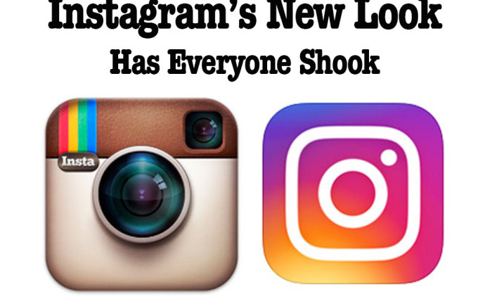
Practically everyone who has a smart phone uses Instagram, so when there is an update, it affects a lot of people. And wow, people are affected! Yesterday, Instagram unveiled one of its biggest updates ever. The company changed its trademark icon as well as the appearance of the entire app, touting that the new design is simplified and puts more focus on your photos without changing how you navigate the app. I’ll walk you through all the changes so that if you haven’t updated yet, you can know what you are getting into!
First things first, the icon is completely new. Gone is the familiar rainbow stripes with the little “Insta” on the top left. The new symbol is a plain white camera icon on top of a gradient background. Some people say they love the new simpler look, others are going bananas, crying that it was a step in the wrong direction (to put it lightly). Personally, I’m not used to it yet and miss the old version already.
The changes to the actual app, however, make me much happier! The look is a bit more modern, with the white lines between photos now almost invisible, and the and the blue text being replaced with more minimal black. Also, notifications are now a light reddish-pink color replacing the old orange. It is less colorful than before, but seems cleaner too, which is nice.
Some changes can be good and others turn out to be bad, but all changes take time to get use to. Let me know what you think of the new update to Instagram. Do you love the simplified look or are one of the protesters who is planning to hold off updating for as long as you can?
Comments RSS Feed